I would like to restart discussions (again!) around re-designing the skimage logo. Our current logo is not very, err, iconic, and is not colorblind-friendly.
We have a preliminary design (a little owl) and a designer that we can work work. The thinking after the last round of discussions was to take the owl, dress it in scientific Python ecosystem colors, and go with that. But, perhaps we have talented graphics artists in the community who want to weigh in with other ideas!
So, next step is to collect a few of us who can form a logo design committee, to have the committee figure out what should be done, and then to work with a designer to make it happen.
Invite your friends, let’s make it happen! Just think of the cool stickers we’ll soon have.
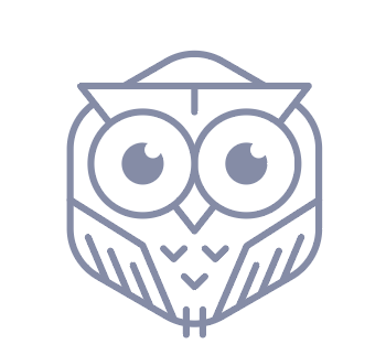
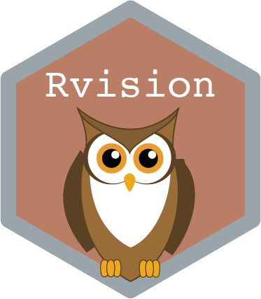
EDIT: Here is the preliminary owl logo. Greg pointed out that Rvision already uses an owl, FWIW.
Hey, this topic came up recently with a friend who is a professional graphic designer. He’s very interested in participating in this conversation and potentially contributing a logo. I’ll invite him to our forum and ping him here. Hey @fabo-grafik, welcome!
Today, I showed him a bit of what scikit-image can do, how the process went for NumPy and also had a look at logos in our scientific ecosystem in general, e.g. the community partners on image.sc. We could pitch him something specific (like the owl or shrimp idea), but personally I am very happy to see him come up with his own ideas and suggestions with a perspective outside of our scientific engineering bubble. Let me / us know what you think!
Hi and welcome @fabo-grafik; I’m so excited that you are interested on helping us out with our new logo design!
As you can see from the above, we are fairly open in what we will consider (owl, shrimp, octopus, gold nuggets, …). I think more abstract is probably better; we need the logo to be instantly recognizable, but we can associate anything with skimage over time.
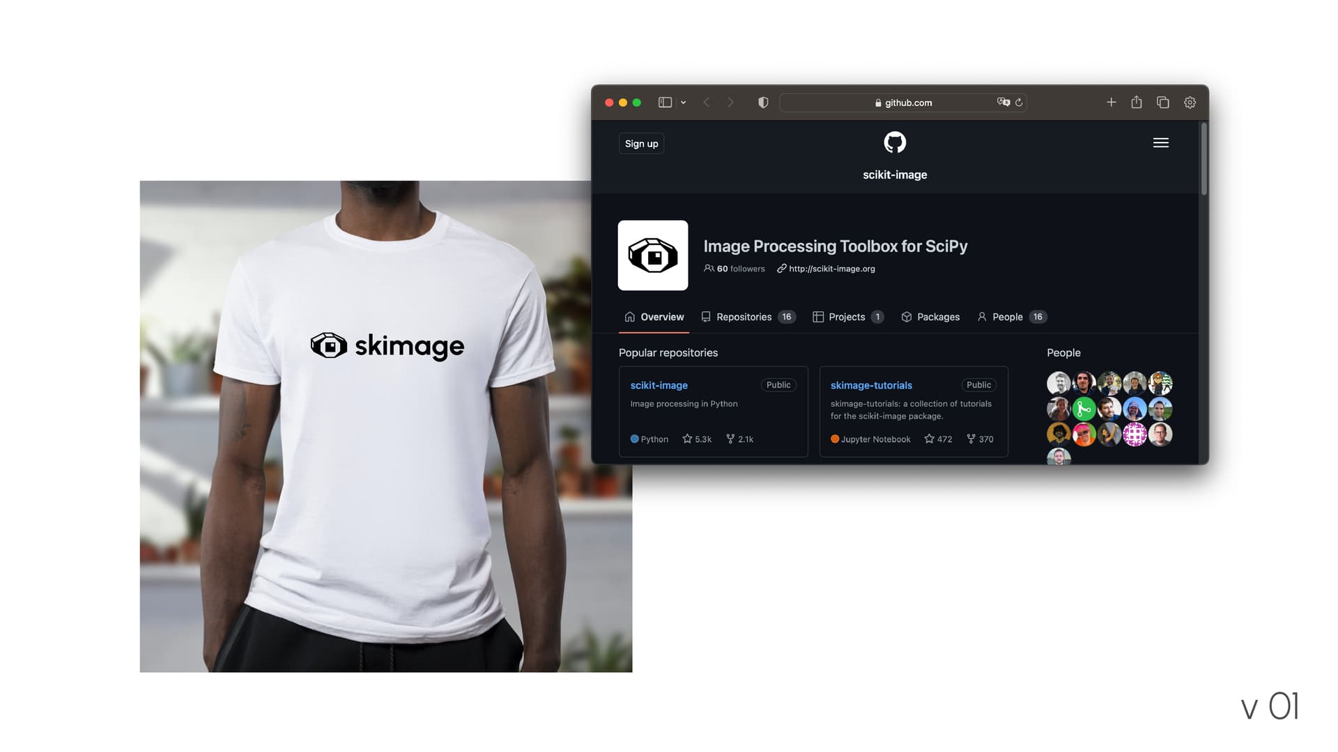
The library name for scikit-image is skimage (pronounced es-kay-image), so some people have suggested, somewhat jokingly, that we use a skiing mage (ski-mage). Cute, even though it may lead to some pronunciation difficulties for our users!
Color-wise (and perhaps this is a discussion for later), inspirations can be:
Hi! Thanks for the warm welcome and the input. I’m excited to contribute to your project. I did start with the first drafts, but I will need some more time. I plan to post first ideas within the next weeks. The beginning of this year was quite bussy and I’m sorry it took me this long to reply.
Hi again! I’am happy to show you the first drafts. The name Scikit-image was a bit of a challenge, because of the visual separation between the two words. A logo should be a unit in itself, so that everyone can recognize it easily. While it is possible to use “scikit-image”, I think the better alternative would be to use “skimage” as the name. Not only is it visually more clear, it also makes the pronunciation easier as well. Also, the transition could be rather smooth, because, as @stefanv mentioned, the library name is already known by all users.
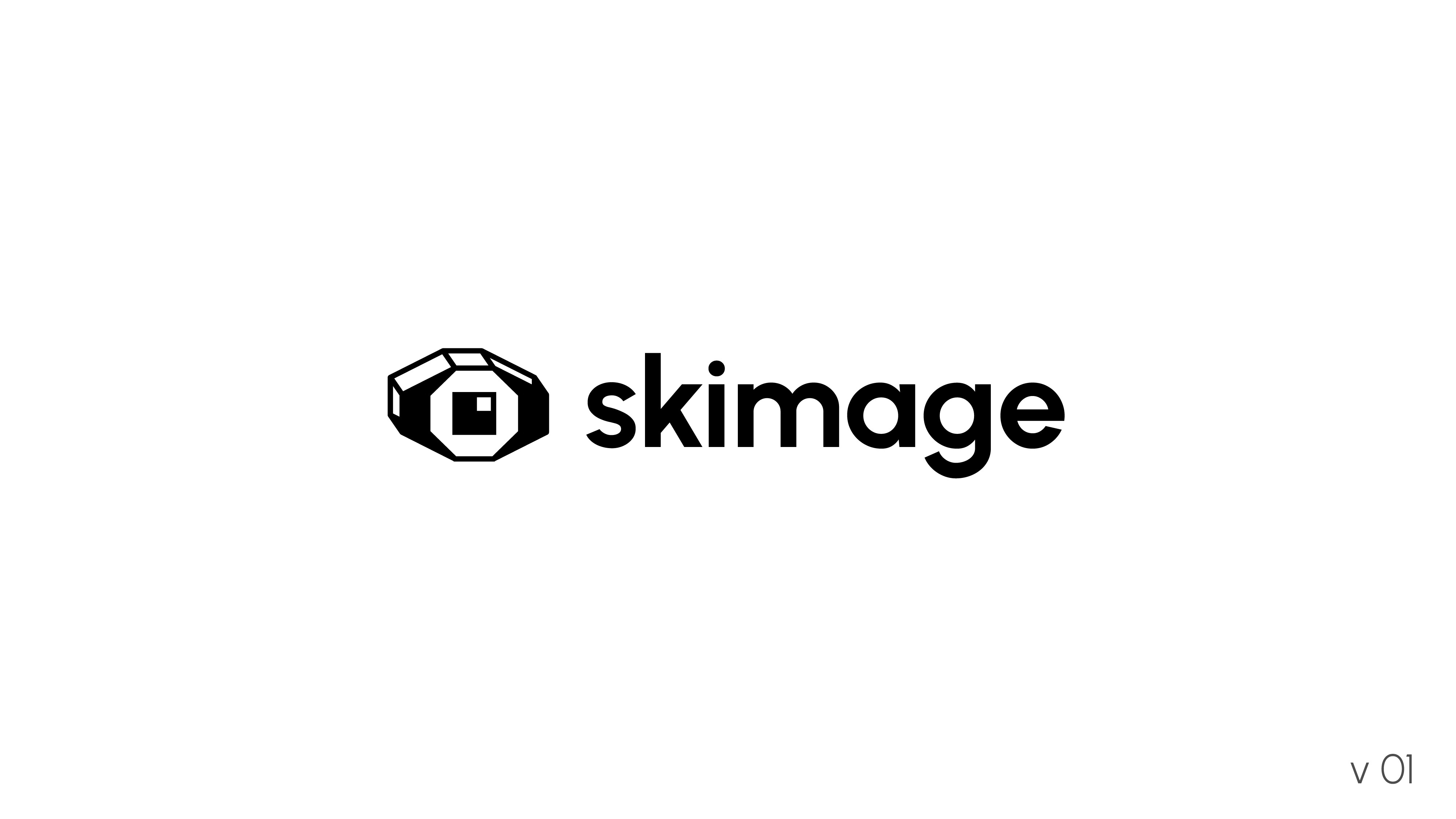
v 01:
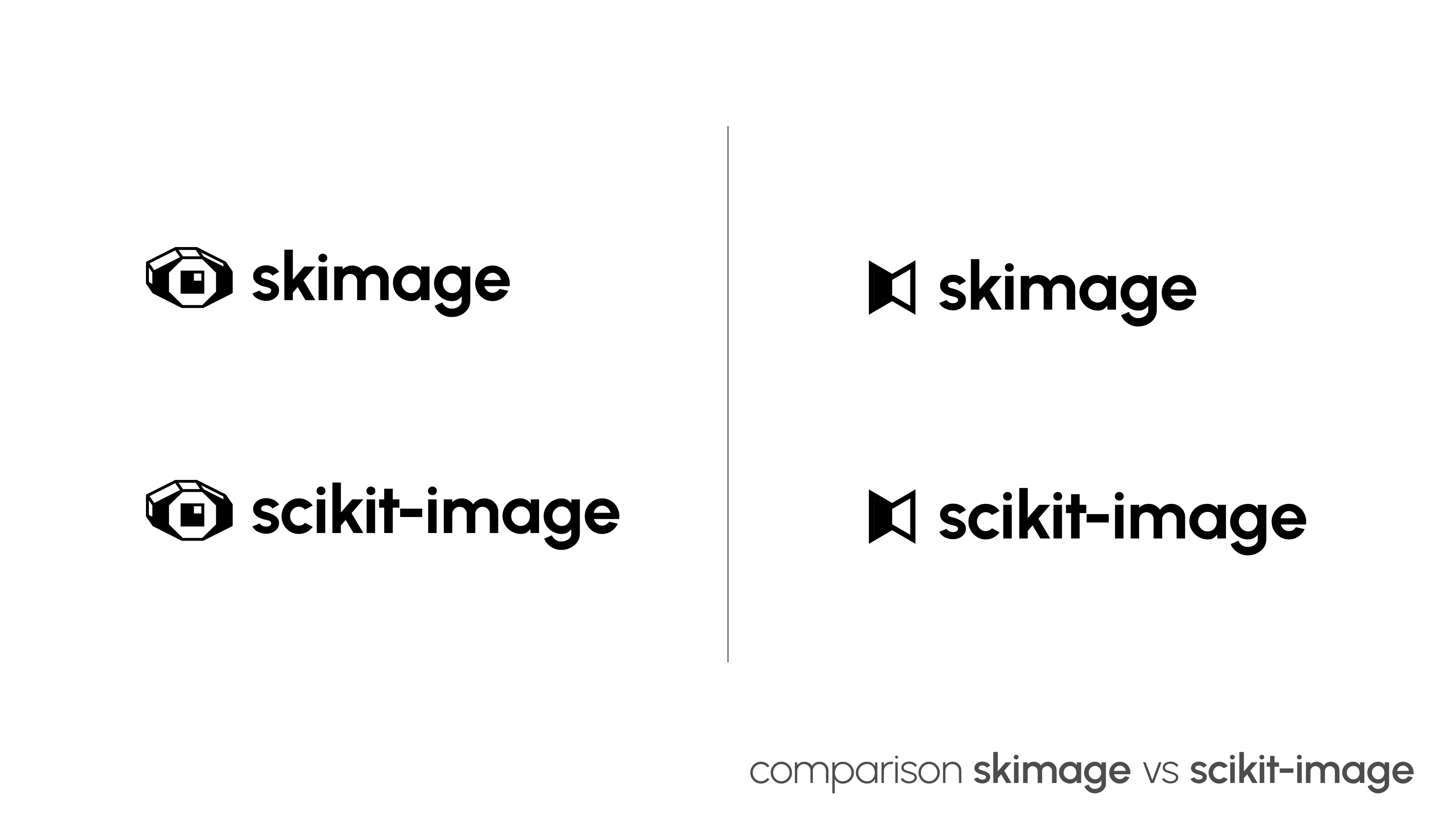
The connection from the eye to “image” is rather obvious, but by giving it a technical look it can function perfectly as a recognizable and unique mark for skimage. Also I was told, that skimage can be used for multi-dimensional pictures/data, which is represented by the 3d look.
v 02
The second version is a bit more abstract. It symbolizes the transformation skimage does to images. The bent look also shows the three (and more) dimensional aspect.
I really like it, especially the technical / pixelated look of the pupil and the light reflex. I feel like the 3D perspective may be off in a few places but that’s minor stuff and may be only me. What do you think about creating the 3D perspective in a different way? E.g. with filled parallelograms instead of using the edges. That would make it similar to NumPy’s logo. But perhaps that would also make it more difficult to have a clear monochrome logo?
Another thought: make the pupil more snake like (while retaining the pixelated look) to have a closer association with Python?
v 02
I like the idea to symbolize the transformation somehow and like the look. Though, maybe it doesn’t look unique / distinct enough? I also didn’t make the connection between the bent look and higher dimensional transformations. Maybe using a perspective like with v01 could work to achieve this?
“skimage” vs “scikit-image”
As I already mentioned over a private channel using “skimage” instead of “scikit-image” may be a bit controversial unless we decide to rename the entire project. But I’m happy to discuss it. Personally, I’d prefer the longer “scikit-image” as long as our project is named this way. Renaming our project is difficult because it would outdate a lot of links and project requirements out there. Though, I’ll grant you that ignoring history I’d be happy if project, package and namespace where using the same name “skimage”.
Hi @fabo-grafik, thank you for sharing these draft designs, and for the effort you put into imagining concepts that may fit the library well!
When I look at the proposed logos they don’t immediately invoke a strong connection to familiar concepts for me. E.g., the concept of an owl made sense to me because we know eyes see well, but also connects with warm pre-existing feelings about animals & owls. Or the array type designs resembled pixels, again concepts very familiar to those who work with arrays. The second concept is highly abstract, but I wouldn’t be able to guess that it is related to image processing.
Having some color in the logo will be important; it’s fine to design in black & white for now, but those will likely be abstracted versions of the logo that we will derive from a more colorful variant.
So, given the above, I wonder if the assignment is too vague. Should the core team get together and make a list of concepts that would resonate strongly, and that are related to image processing?
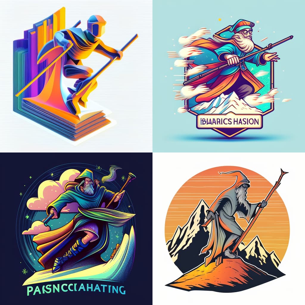
Though tongue in cheek, I wonder whether we should perhaps explore the skiing wizard as well…I asked Midjourney for a concept design along those lines; pretty funny result.
Sorry, I forgot to respond to this thread but I’m on board with all the points you made @stefanv. And I love the four ski-mage candidates from midjourney. Particularly the colour palette tbh.
I do agree, my imagination of the “skiing mage” is kinda funny and cute. But in all seriousness, I worry a bit that people might not take the logo and by association the project and its quality very seriously if we aim for such a logo. It’s also something that seems entirely unrelated to image processing.
But perhaps the sympathy for the skiing mage is a good indicator that we are looking for something a little friendlier and less minimal? What do you think?
This is awesome I love the idea. Just a fly by comment to say that as a user, if the software is good (and it is), I don’t think logo nor name matter much. What a good logo and name bring is a brand and identity. Like Pandas has now Polar and Narwhal with cool logos too. Going with a new identity like that will definitely put the project under the spotlight and that will be a great opportunity to make additional communications. Anyway, love this and hope it gets through
I want to give another opportunity from someone in the community to engage with the logo design. If you know of anyone who can complete this task, please let them know of the discussion. Otherwise, I may just have to do it myself, and I’m not convinced that would be in anyone’s best interest
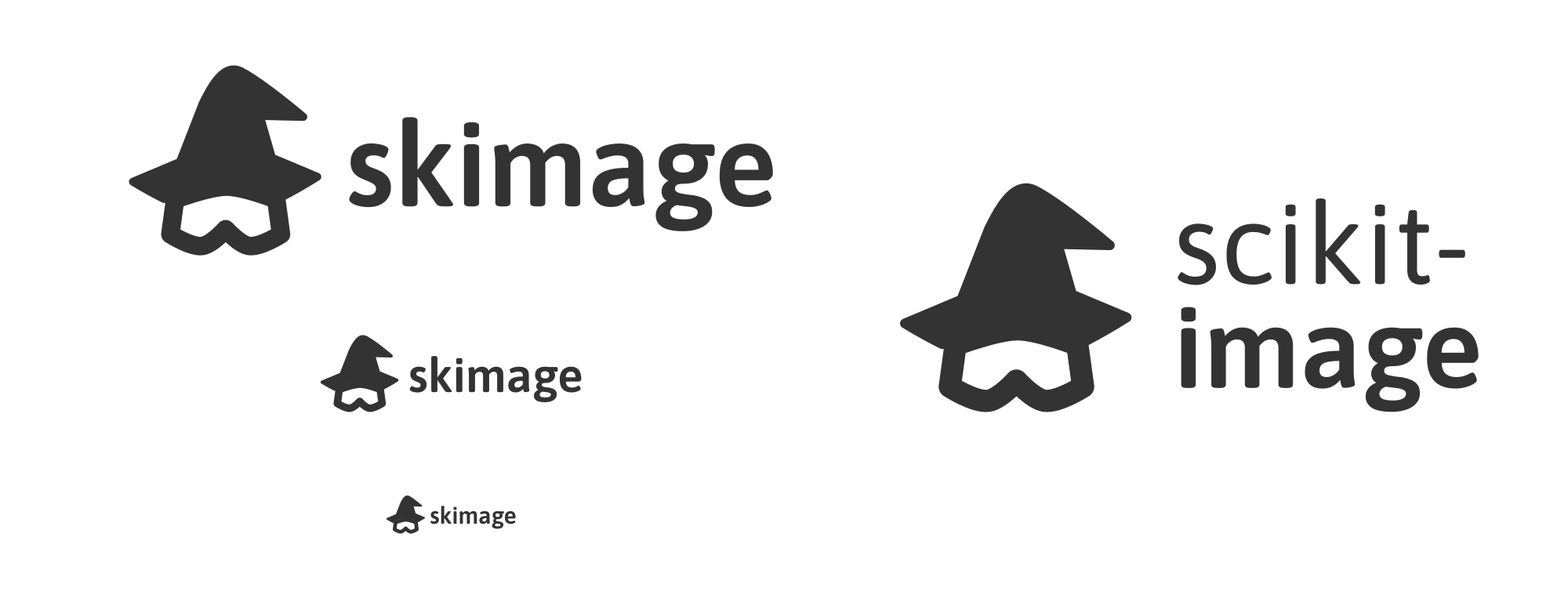
An idea I just had and wanted to try instead of more productive things: I didn’t really feel like ski (the runners) themselves are particularly pleasing for a logo. Instead I had the idea to use ski glasses to represent the “ski” in our name. So, I’ve drawn up a little concept. In case that makes any professionals cringe a little, sorry, and also not sorry.
For the “mage” part, I fell back to the obvious mage’s head. But a cowl might also work – it’s just not as iconic. I kept the logo simple for now, since that was less work and is also kinda fitting for a logo / icon. We could easily add colors or more details to the concept later. The typeface is Asap, just because I like it.
Surprisingly, I don’t hate it. I even love, that the glasses could very well represent safety glasses in a (science) lab! And the association between glasses and magnification or vision is there, too. And that users of skimage are doing magic is a given of course.
Very curious what you think. Feel free to say “I don’t like it”, since it’s very much about personal opinion!
Meta: Also how do we move this forward? I feel like there’s an appetite for a new logo / design, but I gather since this is very much about aesthetics, it might be harder than usual to reach a consensus that everybody loves?


