Also looks like Tux in white shorts! ![]() I like it visually, but the message is a bit difficult for me to read (not that it is easier with the current logo though
I like it visually, but the message is a bit difficult for me to read (not that it is easier with the current logo though ![]() ).
).
I actually love it, and it is by far my favourite out of all the “next” logos that we have tried/seen. I 100% agree that the goggles make the “image” link more explicit and double up as a scientific googles.
In addition to the b&w logo, I’d love a more colourful one. Suggestion: add a radial gradient using the mpl magma (or viridis, but I’ve always preferred magma) colormap, to simulate this kind of “ski goggle” look:

while evoking the scientific Python ecosystem. And also reflecting some magic/science. ![]()
re making a decision, I definitely don’t have much to say but I’m happy to just vote yay/nay among (semi-)active core devs after a complete proposal is put forward.
Yes, given the “tux” thing I also can’t unsee ![]() I’m planning to see if I can tweak the above icon a bit further. Maybe make the hat more crooked and wicked and tweak the glasses to be rounder. Just didn’t give it a priority and didn’t get around to it yet.
I’m planning to see if I can tweak the above icon a bit further. Maybe make the hat more crooked and wicked and tweak the glasses to be rounder. Just didn’t give it a priority and didn’t get around to it yet.
For what it is worth: I like it ![]()
Maybe make the hat more crooked and wicked and tweak the glasses to be rounder
Oh no! I actually like the tux double entendre! ![]() But ok I’ll reserve judgement until I see the revisions. I just don’t think you should discard it based on this, we like Linux at skimage.
But ok I’ll reserve judgement until I see the revisions. I just don’t think you should discard it based on this, we like Linux at skimage. ![]()
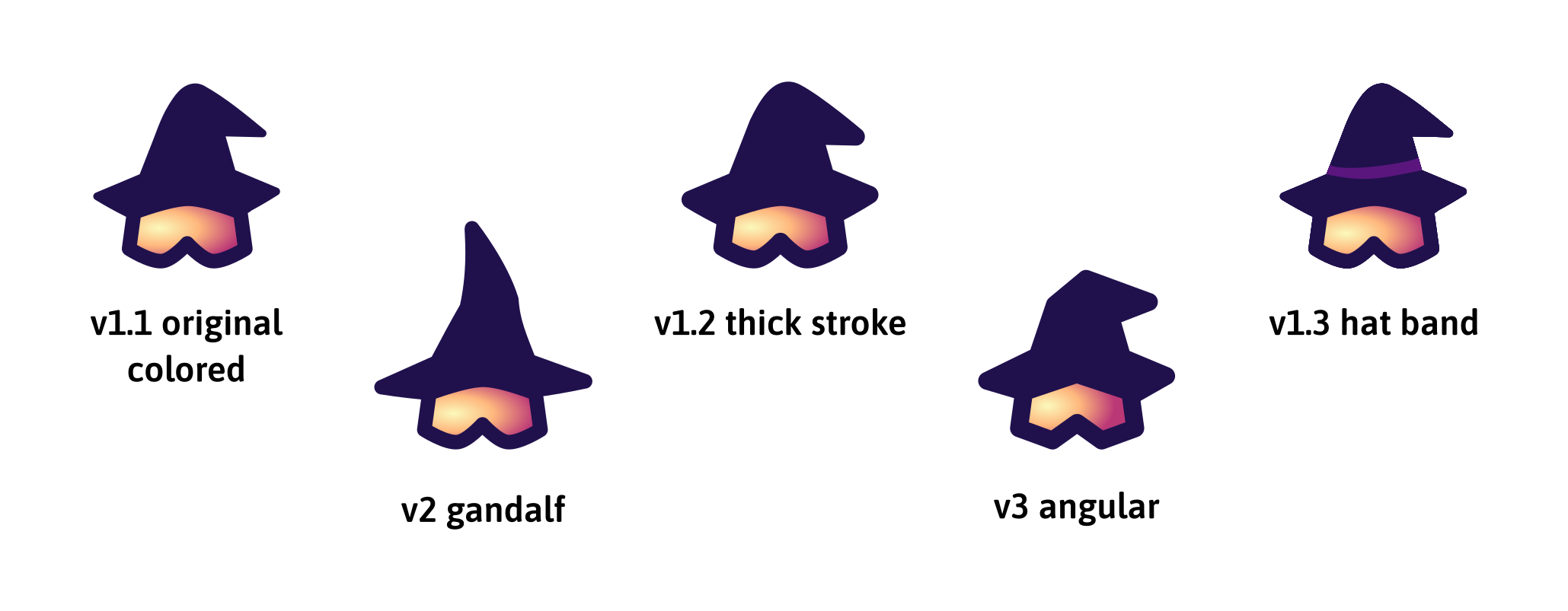
Okay, a few more suggestions and ideas. The colors are picked straight from the magma colormap!
- I think the thick stroke (v1.2) looks a bit better and friendlier than the original one (v1.1)
- the angular one is also kinda cool!
- and of course I have a weakness for the Gandalf inspired hat (v2), but I might want to tweak it a bit to make it cuter. And maybe even try an angular gandalf version if there’s interest.
Nice job, @lagru! I love your logo proposals. I’ll vote (in anticipation) for the angular Gandalf version.
Update: I now prefer “v1.2 thick stroke” (like @jni), perhaps with a thinner stroke though (thickness of “v2 gandalf”), as suggested by Grzegorz.
@lagru Zoku Paris is asking me for our logo (for signage purposes in the context of the upcoming mini-sprint). Could you please me a high res version of the logo you designed which has reached lazy consensus? ![]()
Oh, I’m surprised you want to use the new logo already. Shouldn’t we use the current official logo?
Sorry for not seeing this earlier. I’m not sure which version has reached lazy consensus. But here’s v1.2 but with thinner stroke:

Let me know if you need anything different. I’ve shared the source SVG and other drafts here.
Thanks, @lagru! I sent the current logo because I didn’t want to have them wait. I thought we could use the new logo because it’s a context with no consequences: It’s not published, it’s not shared, it’s not advertised; it’s just printed on a disposable sheet of paper and pinned in a hotel hallway for one day… And perhaps, still, in the process, we may get a feeling of confirmation (yes, it works, I like this logo!).